Broadcast


01/04/23
Dia Art Foundation acquired a large-scale work by stanley brouwn, [walk x m in the direction of...]. It was originally conceived for brouwn’s exhibition at Le Casino in Luxembourg in 2003 and last presented by the gallery as part of Art Basel Parcours in the Kunstmuseum Basel in 2018. It will be on view at Dia Beacon from April 15 onwards. This presentation will coincide with an exhibition dedicated to brouwn’s work at the Art Institute Chicago, curated by Ann Goldstein (AIC) and Jordan Carter (Dia). It is the artist’s first comprehensive solo show in the United States, on view from April 8 till July 31.
04/03/2023
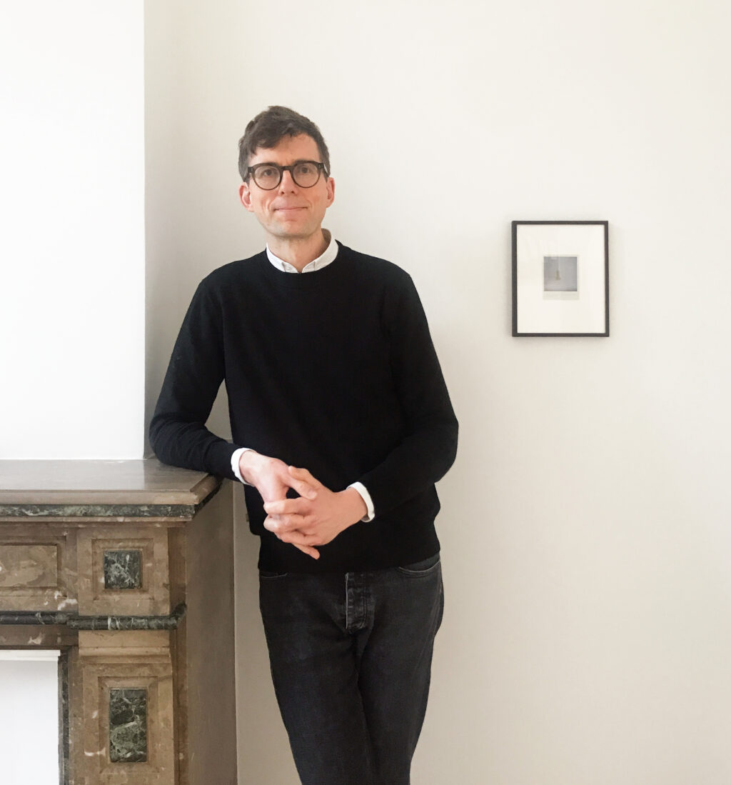
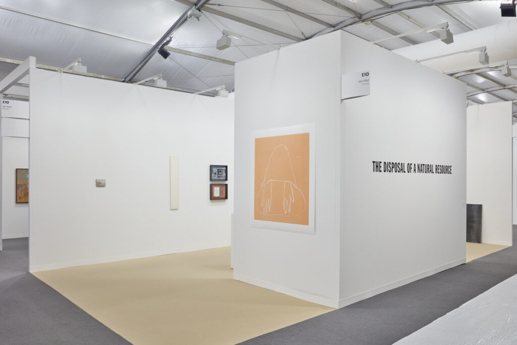
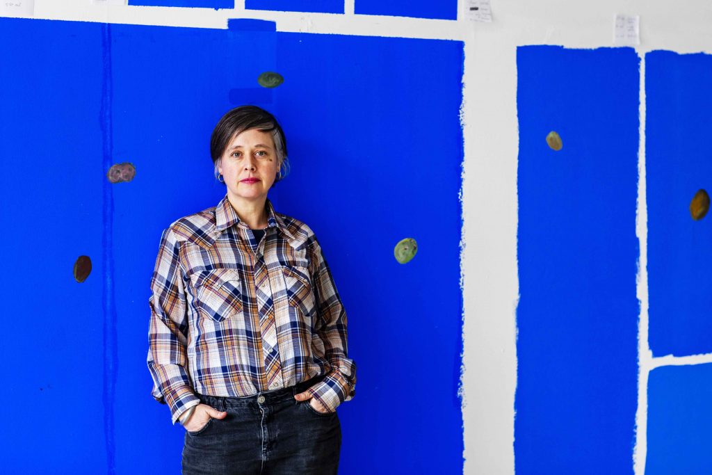
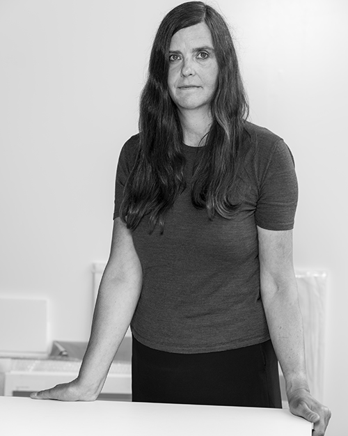
Jan Mot is pleased to announce the appointment of Antony Hudek as its new gallery director. Until recently director of Museum Dhondt-Dhaenens (Deurle), Antony has occupied curatorial positions in institutions including M HKA (Antwerp), Objectif Exhibitions (Antwerp), Raven Row (London), and Tate Liverpool. He was formerly director of the postgraduate Curatorial Studies programme at KASK – School of Arts (Ghent), and has taught at numerous art schools and universities, among them Slade School of Fine Art – UCL (London), Royal College of Art (London), John Moores University (Liverpool), and the University of Antwerp.
07/01/2023
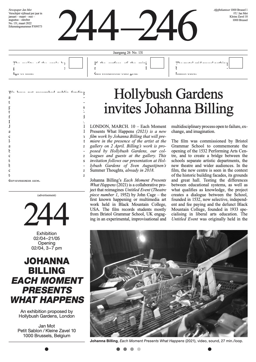
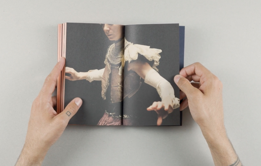
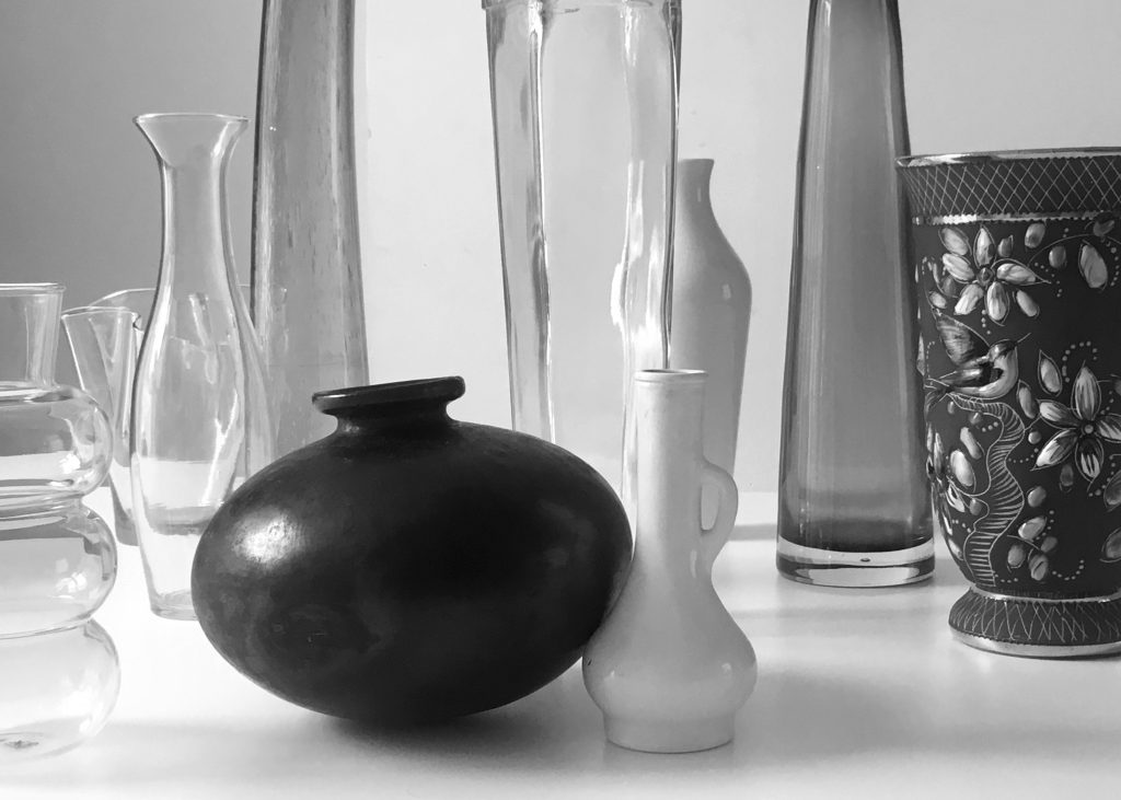
On the occasion of Passage for Persona, the upcoming solo exhibition of Manon de Boer opening at the gallery on Saturday, January 28 from 3 to 7 pm, we are pleased to announce the presentation of the edition Cast by Manon de Boer. Previously presented at Kunstmuseum St. Gallen (CH) and Museum Dhondt-Dhaenens (BE), it consists of 29 unique Polaroids, each of which represents an important inspiration for Manon de Boer. A selection of editions will be available for purchase at Jan Mot, Brussels. Each edition has a certificate of authenticity, in a box specially designed by Clara Gevaert. Only three Polaroids of each vase exist: one exhibition copy, the edition of Kunstmuseum St. Gallen and the edition of MDD. Price: €450 (incl. VAT) per Polaroid.
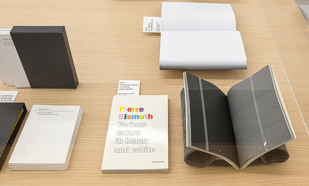
22/07/22
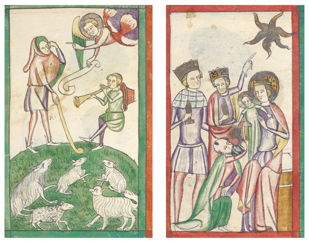
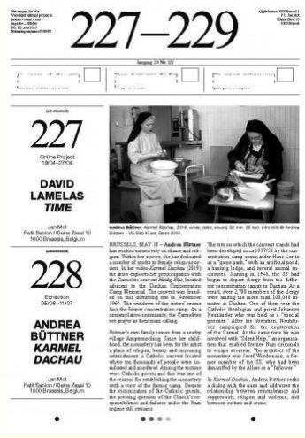
Johanniterkirche Feldkirch presents a solo exhibition by Andrea Büttner in partnership with Kunstmuseum Liechtenstein. It opens today, July 22 and it will be on view until September 23, 2022. Büttner’s work Shepherds and Kings (2017) consists of a double slide projection of 160 historical images, showing how shepherds and kings have been depicted in Nativity scenes throughout art history. This comparative presentation of Büttner’s assembled collection of historical images follows no particular chronology or style, engaging instead in an iconographic exploration of gestures and their implicit resonances with qualities of shame, vulnerability and dignity. (Image: © Andrea Büttner, Shepherds and Kings, 2017)
01/06/22
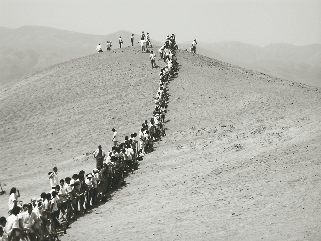
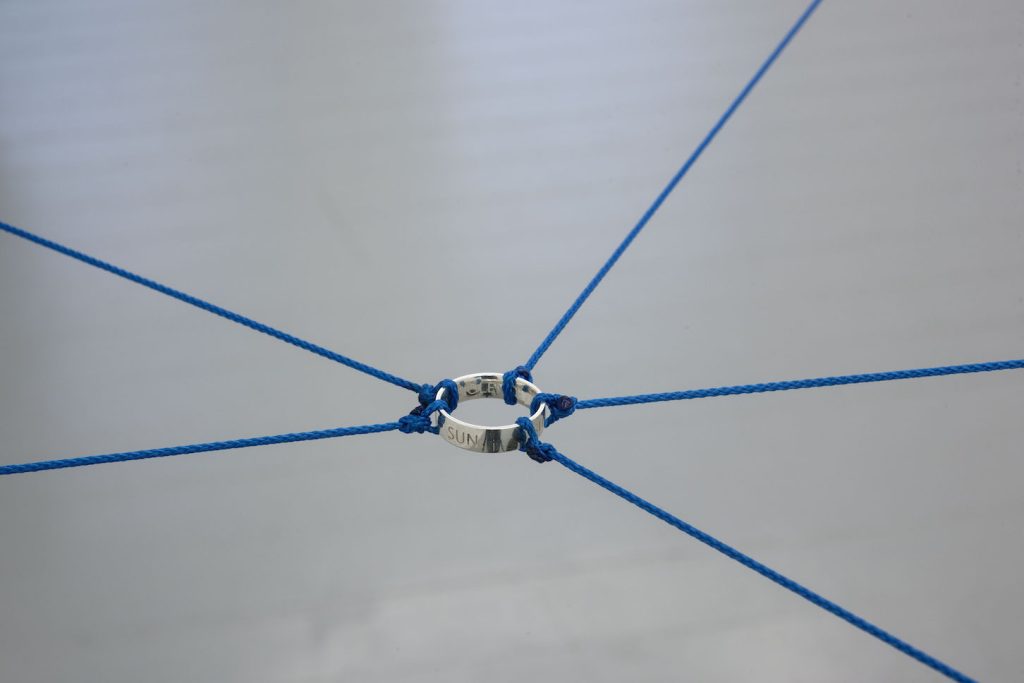
The gallery is happy to announce its collaboration with art consultant Daniela Zarate Guzman in Mexico City. (N. Date, Forever Connected Through the Sun, n.d., Photo: Mario Garcia Torres)

24/02/22
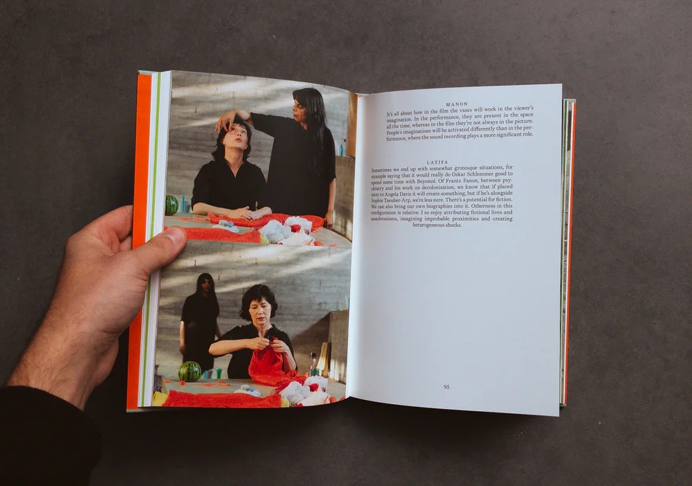
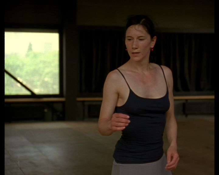
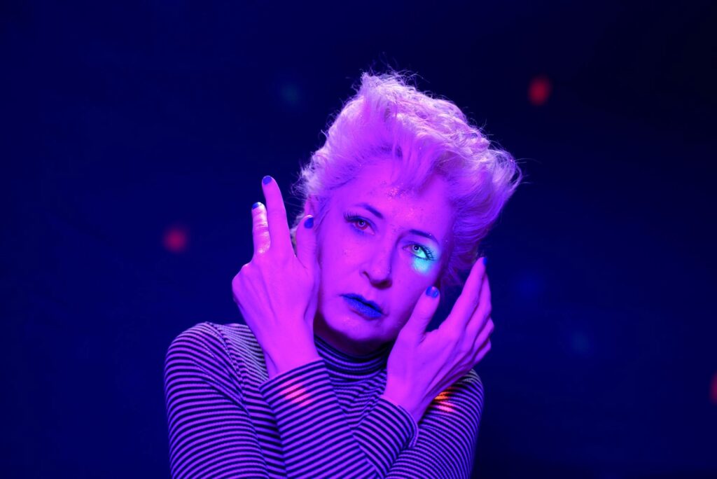
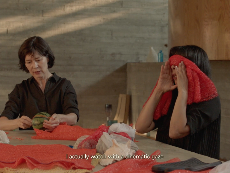
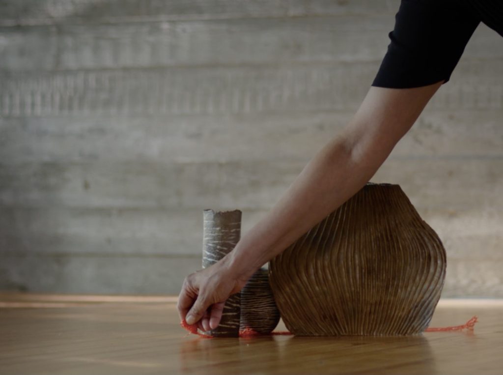
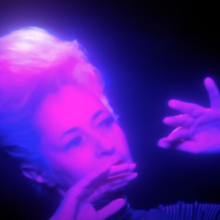
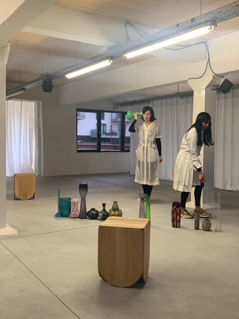
On March 1st the Cinematek in Brussels is organising a double premiere of works by Manon de Boer and Latifa Laâbissi in presence of the artists (at 7 and 9pm). In Ghost Party (2) (2022, 58'), De Boer and Laâbissi create little fictions with vases, stones and other materials, while giving voice to texts of 'ghosts' from their shared genealogies, like Marguerite Duras, Serge Daney, Casey and Eduardo Viveiros de Castro. In this polyphony of voices and accents their beings blend with others, subtly questioning the politics of language and identity (7pm). Persona (2022, 31') is a film based on Écran Somnambule, a performance by Latifa Laâbissi (2012) in turn based on the film “Mary Wigman tanzt” (1930), an excerpt of “La Danse de la sorcière” (1926). This second screening (9pm) will furthermore include two films by Chantal Akerman Portrait d’une paresseuse (1986, 8’) and J’ai faim, j’ai froid (1984, 13’). (Image: Manon de Boer and Latifa Laâbissi, Persona, 2022).
15/02/22
Jan Mot is now a member of the International Galleries Alliance, a new collaborative non-profit association for art galleries. Since October last year, 250 members have joined IGA from across 53 countries. On March 15, IGA launches its newsletter, a weekly showcase of artists represented by its members. These temporary formations are randomly generated to create combinations of galleries and artists new, established, and rediscovered. Visit www.international-galleries-alliance.org for more information and to subscribe.
22/12/21
The gallery will be closed from 24/12 until 09/01. We wish you a peaceful holiday period.
06/12/21
It is with sadness that we inform you of the death of
Jesse Van Bauwel
our dear colleague and friend,
life partner of Hana Miletić,
great art professional,
and much more than this,
in Brussels on December 3, 2021.
We send our condolences to his family and wish them a lot of strength.
A final tribute to Jesse can be given in the Funerarium « Euro Funeral Home », Hallestraat / Rue de Hal 102 in 1190 Brussels on Monday 6th, Tuesday 7th and Wednesday 8th December from 4 to 5 pm.
The ceremony will take place in the crematorium of Brussels in Uccle on Friday 10th December 2021 at 2 pm, followed by the scatting of the ashes at the Memorial Park. Meeting at the crematorium at 1.40 pm (Stillelaan / Av. du Silence 61 in 1180 Brussels).
We miss you.
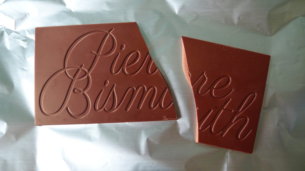
Francis Alÿs, Sven Augustijnen, Pierre Bismuth, Andrea Büttner, Manon de Boer, Daphné Charitos, Rineke Dijkstra, Mario Garcia Torres, Dominique Gonzalez-Foerster, Joachim Koester, David Lamelas, Sharon Lockhart, Jan Mot, Clare Noonan, Tino Sehgal, Tris Vonna-Michell, Julia Wielgus
08/10/21
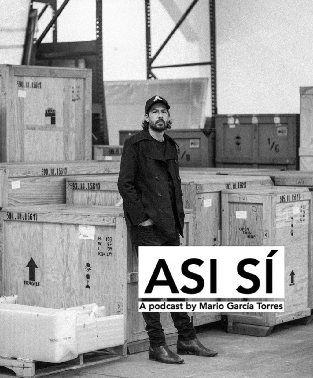
From today, the soundtrack of the performatic conference We Shall Not Name This Feeling by Mario Garcia Torres and Sol Oosel is available on Spotify and Apple Music.
The work was conceived for Mario Garcia Torres' exhibition Poetic of Return at MARCO, Monterrey (MX).
@mariogarciatorres @soloosel
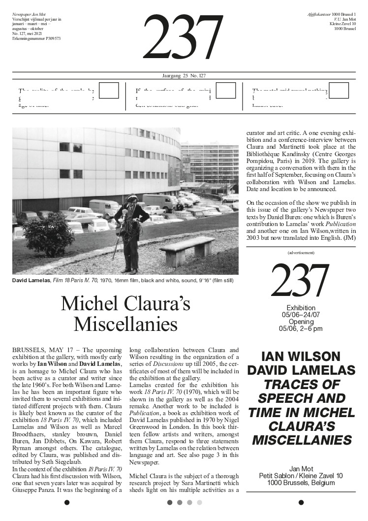
07/09/21
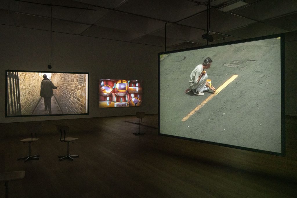
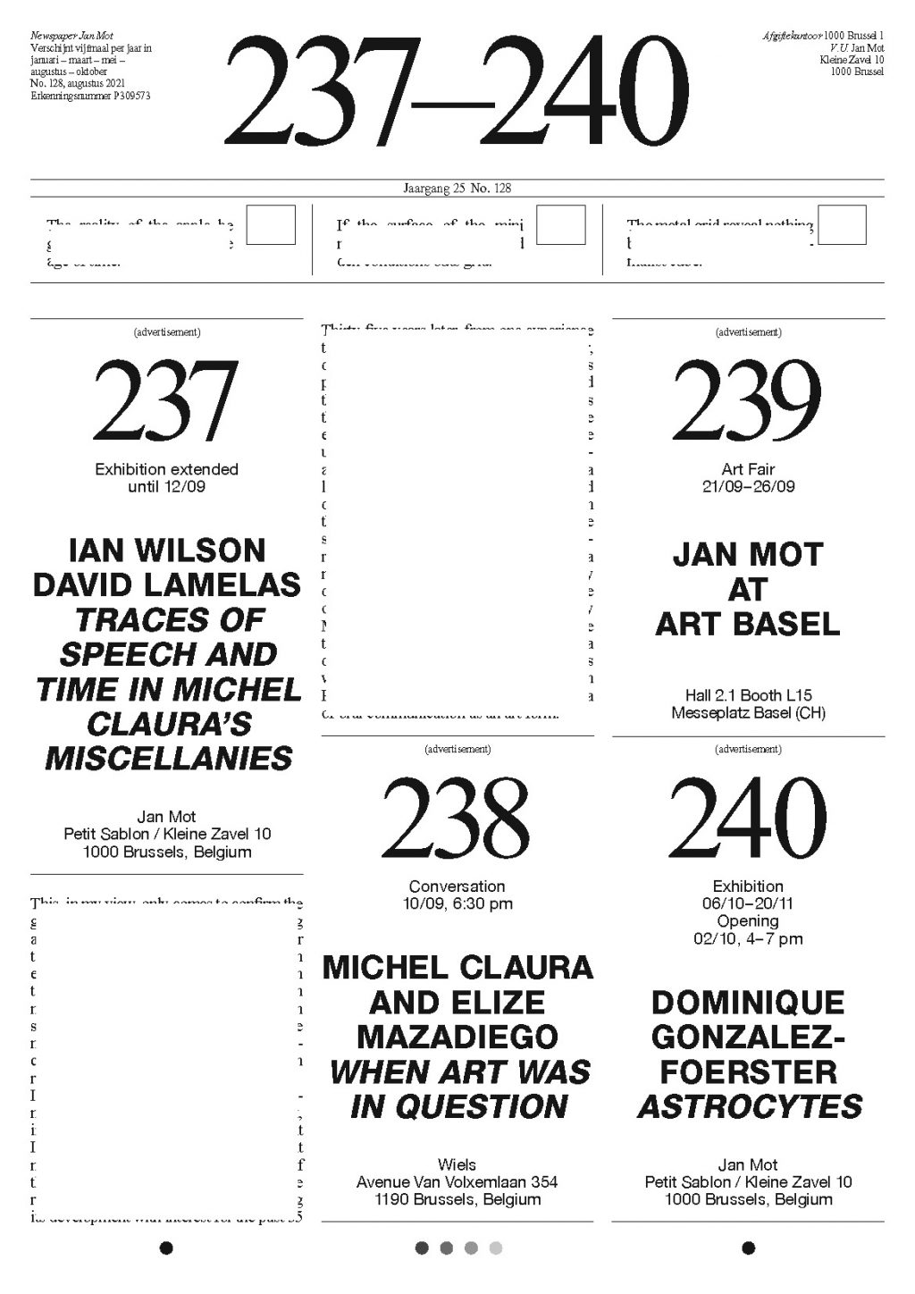
During Brussels Gallery Weekend is the last chance to see the exhibition Ian Wilson, David Lamelas. Traces of Speech and Time in Michel Claura's Miscellanies at the gallery (until 12/09) and unique opportunity to attend the conversation When Art Was in Question A Conversation with Michel Claura and Elize Mazadiego at WIELS, Brussels (10/09, 6.30 pm, reservations via wiels.org).
Please note the extended opening hours during BGW:
Opening, 09/09, 11 am - 9 pm
10/09 - 12/09, 11 am - 7 pm

26/06/21
The Brussels-based production and distribution platform Auguste Orts founded by Herman Asselberghs, Sven Augustijnen, Manon de Boer and Anouk De Clercq was appointed to curate the 10th edition of Contour Biennale in Mechelen in fall 2023.
Since 2003, Contour Biennale has grown into a locally and internationally acclaimed exhibition focussed on the moving image. The four artists want to explore how they can unlock the archive and memory of the biennial in order to give it a place amidst new works and thus propagate the importance of the event in and outside Mechelen.

30/03/21
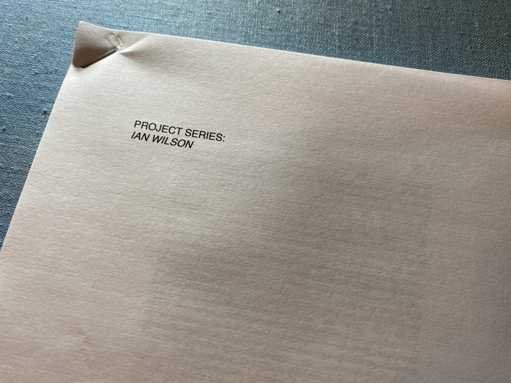
On April 6th, 2021 the gallery will participate in a special online publication event by Antinomian Press dedicated to Ian Wilson: Ben Kinmont. Project Series: Ian Wilson. The publication is an interview between Ben Kinmont and Ian Wilson that took place on the 19th of October, 1997, in Kinmont’s home in NYC and was never published before.
Occurring simultaneously in nine different cities, this printing event will be streamed live from Los Angeles, Vancouver, Sebastopol (CA), Toronto, New York City, London, Brussels, Paris, and Berlin. There will also be a conversation between MoMA curator Christophe Cherix and Ben Kinmont discussing the publication, the work of Ian Wilson, and the Antinomian Press.
The event will take place at 6 pm (CET) and in order to follow live, please register here.
16/03/21

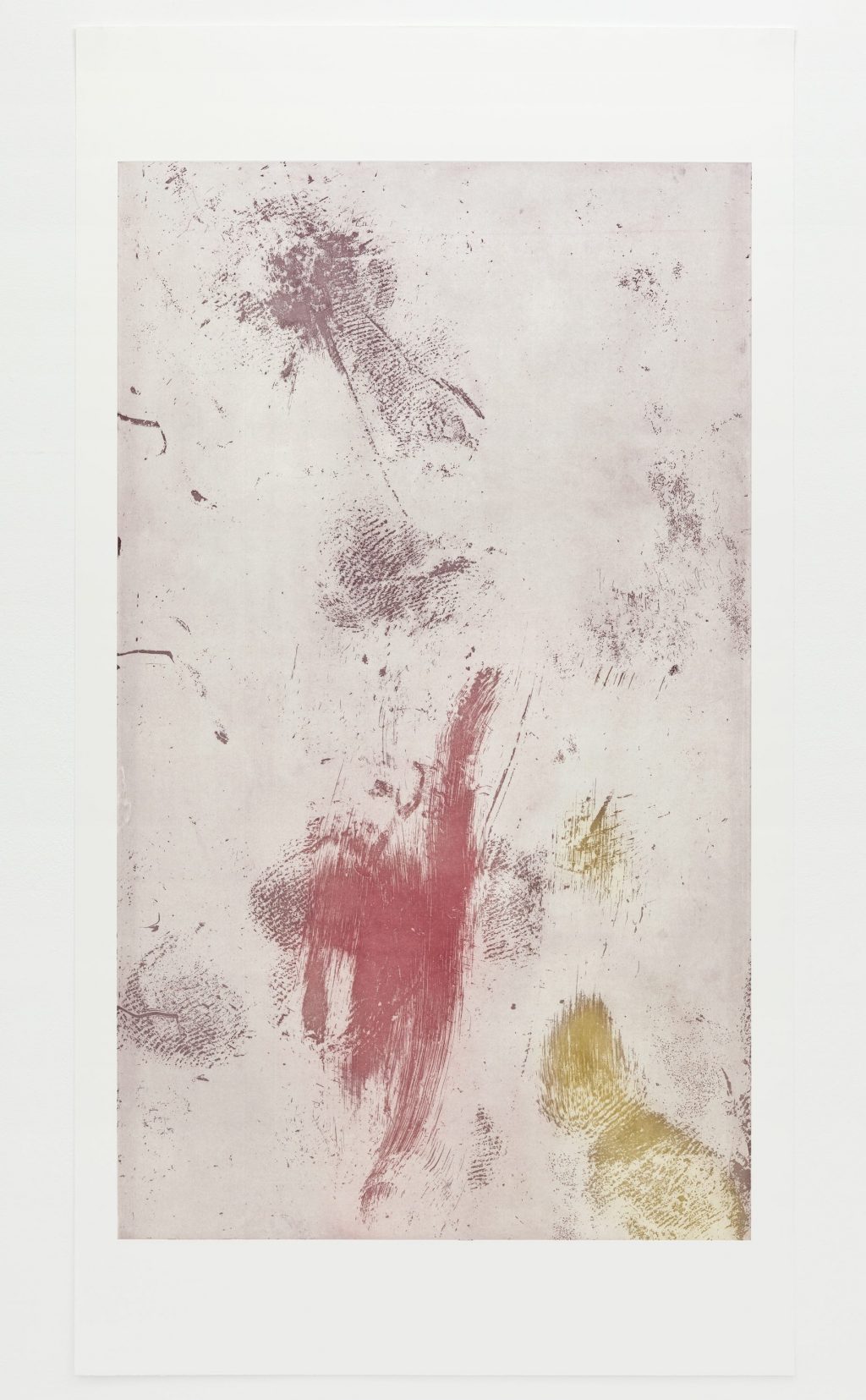
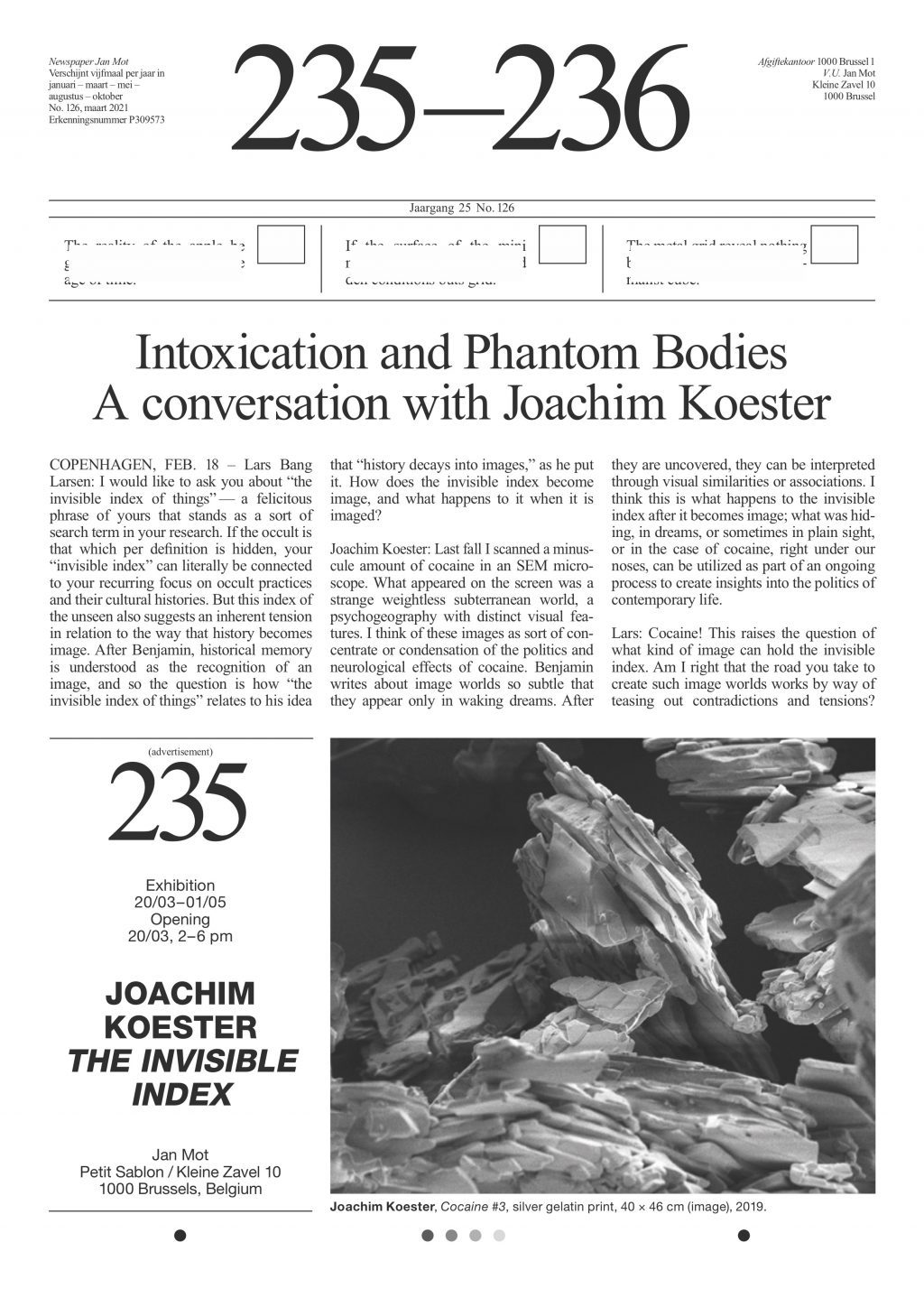
Simultaneously with his show at the gallery, Joachim Koester's solo exhibition at Museum Dr Guislain opens on Saturday 20/03. The exhibition titled Altered States brings work together that investigate unknown territories, both geographical and mental. An ‘altered state of consciousness’ refers to a temporary change in the mental state. The cause is often external, such as a drug or a ritual, but also internal, such as a psychosis or simply a daydream. Koester shares his fascination with the effect of intoxicants with shamans and hippies, but also with psychiatrists. The latter recognised the therapeutic possibilities, but they were also confronted with the destructive power. Joachim Koester’s work delves into the historic context in which drugs were grown, traded and used, and draws parallels with the contemporary situation. Big and small stories impartially reveal our relationship with intoxication.
14/03/21

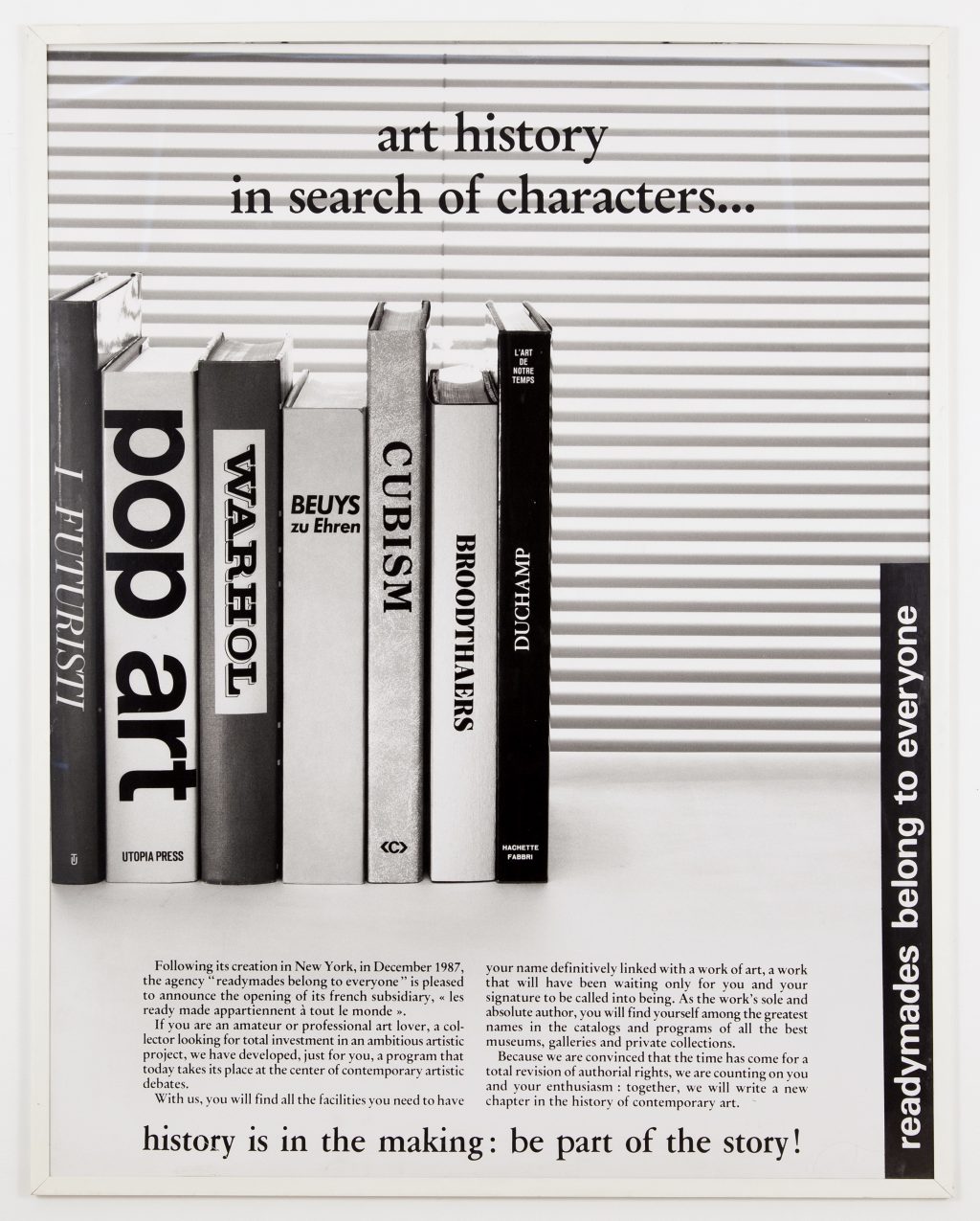
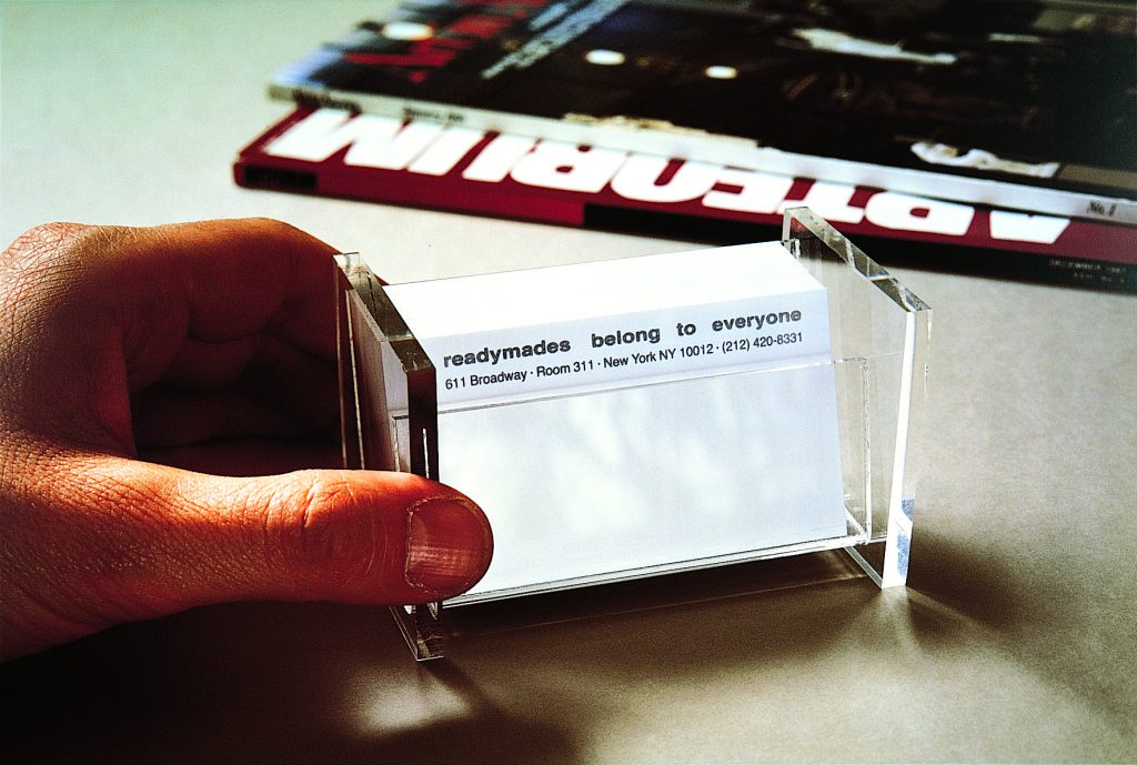
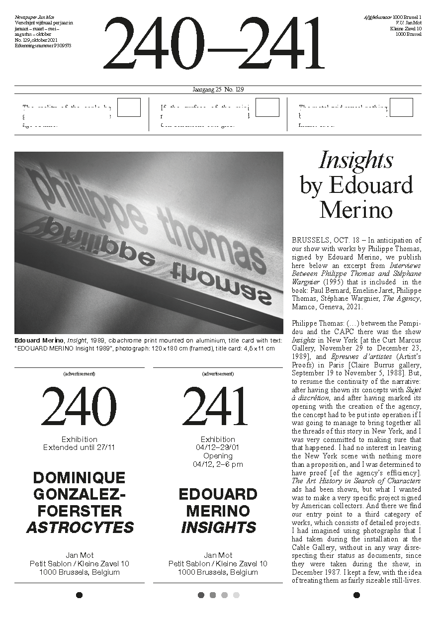
Created by the French artist Philippe Thomas, the communication agency called readymades belong to everyone®, for its American version inaugurated in 1987 in New York, and les ready-made appartiennent à tout le monde®, for its French version, is an entrepreneurial structure behind which the artist disappears. MAMCO owns all of this agency, which ceased to operate in 1995. The book The Agency (L'Agence) is the first systematic and exhaustive study of this enterprise which has radically questioned the figure of the author. The book also contains the last unpublished interview with Philippe Thomas, which provides an understanding of the profound coherence of his artistic project. Includes also texts by Paul Bernard and Emeline Jaret. Published by MAMCO in 2021 in both French and English version.
10/02/21
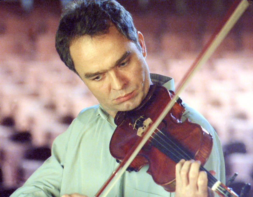
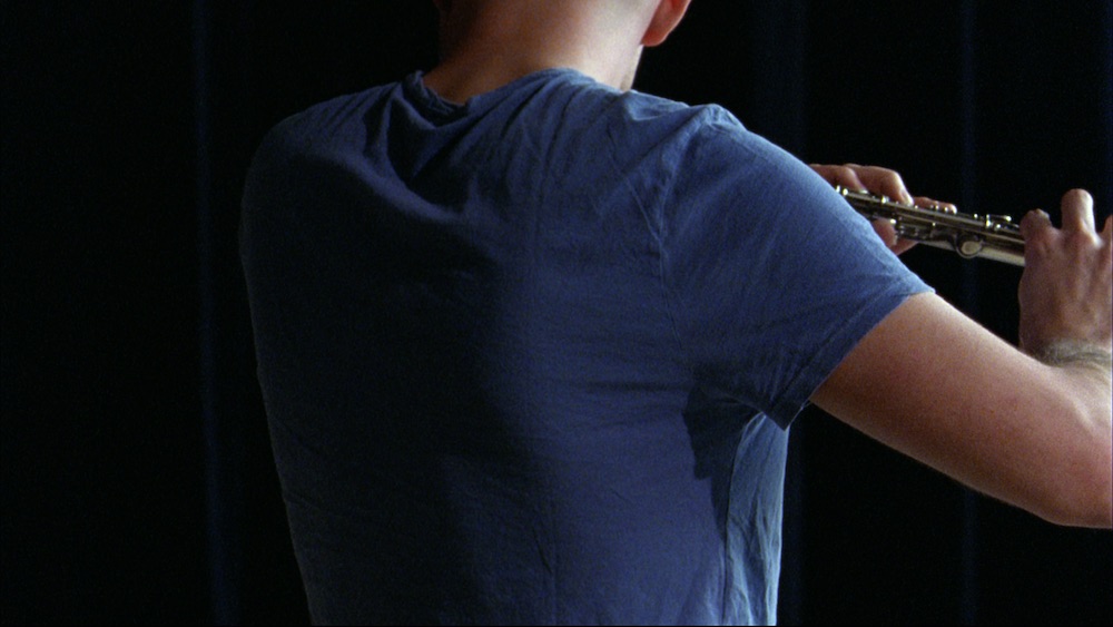
Zürcher Kunstgesellschaft acquired Manon de Boer's work Presto, Perfect Sound (2006). The film depicts composer and violinist, George Van Dam, performing Béla Bartok's sonata for violin solo, Presto. Manon de Boer filmed George van Dam six times playing the whole piece while at the same time recording the sound. In order to achieve the ‘perfect’ soundtrack, she gave George van Dam the six sound recordings and asked him to reconstruct the Bartok piece into a perfect sound piece. Afterwards de Boer synchronized the filmed image to this soundtrack. The jump-cuts in the image visualize the cuts in the sound, while the sound sounds continuous. In allowing the audio sequence to dictate the image on screen, de Boer inverts the traditional dominance of image over sound in cinema. The film is a meditation on the relationship between sound and image and offers an intense reflection on a moment of creative concentration.

30/12/20
David Lamelas’ online performance Time 2020-2021 will take place on December 31st to coincide with the transition into the New Year in South-Korea. The performance is organised by Enna Bae and Sung woo Kim in the context of their exhibition Welcome Back currently on view in Seoul.
You can follow in real time the performance on youtube via this link:
You can follow in real time the performance on youtube via this link:
https://www.youtube.com/watch?v=Ge9h3Dy-GYw&feature=youtu.be
It will start at 11:45 pm KST (Seoul), 3:45 pm CET (Paris), 9:45 am EST (NYC).
It will start at 11:45 pm KST (Seoul), 3:45 pm CET (Paris), 9:45 am EST (NYC).
18/12/20
The film Sandlines, the Story of History (2018-2020) by Francis Alÿs was awarded with the “Best Feature Documentary Award” by the Olympia International Film Festival for Children and Young People.
Visit the festival's page to read more. See the trailer of the film on Francis Alÿs' website.
02/12/20
Jan Mot is delighted to announce the representation of Andrea Büttner.
Andrea Büttner (°1972 in Stuttgart, lives and works in Berlin) connects art history with social or ethical issues, exploring broad-ranging topics such as poverty, labour, community, Catholicism, music, botany, and philosophy. Her work is based on thorough research into specific areas or situations, and she often appropriates or references other artists and thinkers including HAP Grieshaber, Corita Kent, Immanuel Kant, Gwen John, Andy Warhol, Dieter Roth and Simone Weil. Her diverse practice is articulated through formats encompassing print, sculpture, weaving, but also photography, video, instruction pieces, and works with live moss and wet clay.
Büttner was first celebrated for her bold use of what is often seen as unfashionable media, namely woodcut and glass painting. Ideas of shame, vulnerability, poverty and embarrassment run throughout her work, countering the romantic and heroic nature associated with much artistic practice. Martin Herbert writes “Büttner’s art can be read as a form of empathy – an exemplary outstretched hand, not from above but from across.” (Artforum March 2015).
Büttner studied at the Royal College of Art in London, Humboldt University of Berlin, and Berlin University of the Arts. She was a nominee of the 2017 Turner Prize and is a winner of the 2009 Max Mara Art Prize for Women. Exhibitions include documenta 13 (2012), Sao Paulo Biennial (2010 and 2018) and solo exhibitions at Museum Ludwig Cologne (2014), Walker Art Center (2014), Kunst Halle Sankt Gallen (2017), Kunsthalle Wien (2016) and Hammer Museum Los Angeles (2017).
Photo: July Zimmermann
26/11/20

In celebration of the new book Seth Siegelaub. Better Read than Dead: Writings and Interviews 1964–2013, the Kunstverein in Amsterdam transforms part of its space into Seth’s Books Bookshop and for the coming month will be selling books exclusively by International General (the imprint of Seth Siegelaub) and about Seth Siegelaub.
07/10/20
We are pleased to welcome you on our new gallery website, which is designed by Marc Hollenstein and programmed by web3000.net.
05/10/20
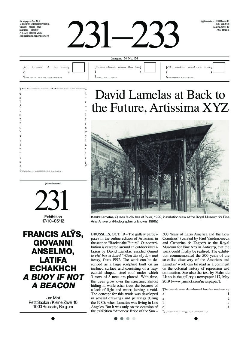
David Lamelas' site specific installation Corner Piece (1966) will be presented as part of the show Collection 1940s–1970s at MoMA New York starting on October 24th. The work will be on view for approximately three years. (Image: Corner Piece at Jan Mot, 2006)
02/10/20
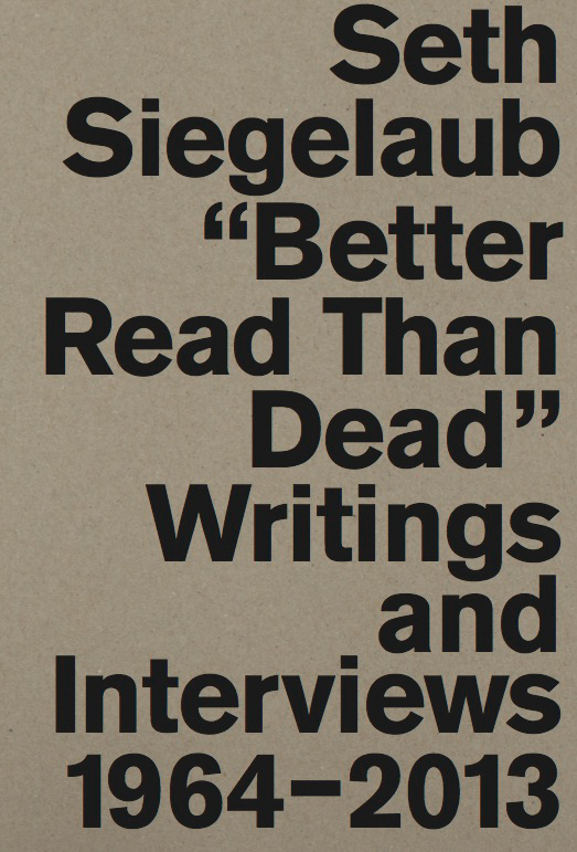
The newly published book Seth Siegelaub. Better Read than Dead. Writings and Interviews 1964-2013 gathers selected writings, interviews, extended bibliography and chronology filling the historical gaps in the sprawling network of exhibitions, publications, projects, and collections that constitute Seth Siegelaub’s life’s work. Siegelaub chose the title Better Read than Dead for an anthology of his own writings — one of the projects for which he never found the time. The book was edited by Marja Bloem, Lauren van Haaften-Schick, Sara Martinetti and Jo Melvin and published by Koenig Books, London and Stichting Egress Foundation Amsterdam.
18/09/20
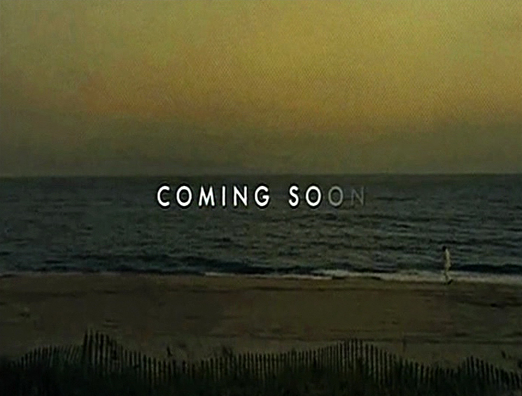
Pierre Bismuth's work Coming Soon is published on the website of the David Roberts Art Foundation (Click here)
Coming Soon is a fast-paced compilation of the closing seconds of film trailers. It is a familiar final visual in trailers when the alluding, though vague, words ‘coming soon’ are blasted across cinema screens. Bismuth’s compilation is made up of motion pictures by many of the large American film studios and production companies, discernable by the logos that accompany the phrase. Where it is possible to decipher what film is being referred to they are all major motion pictures released around 2002-03, including Johnny English, the original Jackass: The Movie, and the only ‘coming soon’ that is accompanied by moving image; Secretary with Maggie Gyllenhaal.
16/09/20
Ghosted by the words of artists and writers such as Marguerite Duras, Anne Carson and Casey, in Ghost Party, their new and first performance together, Manon de Boer and Latifa Laâbissi play with language, accents and voices, meshing their selves with others. The performance is part of the exhibition Risquons-Tout and will premiere at Wiels at the Open School Risquons-Tout (Avenue Van Volxemlaan 316, 1190 Forest/Vorst) on 30th and 31st of October at 6.30 and 8.30pm. This performance was postponed due to the new restrictions. New dates are to be confirmed.
14/09/20
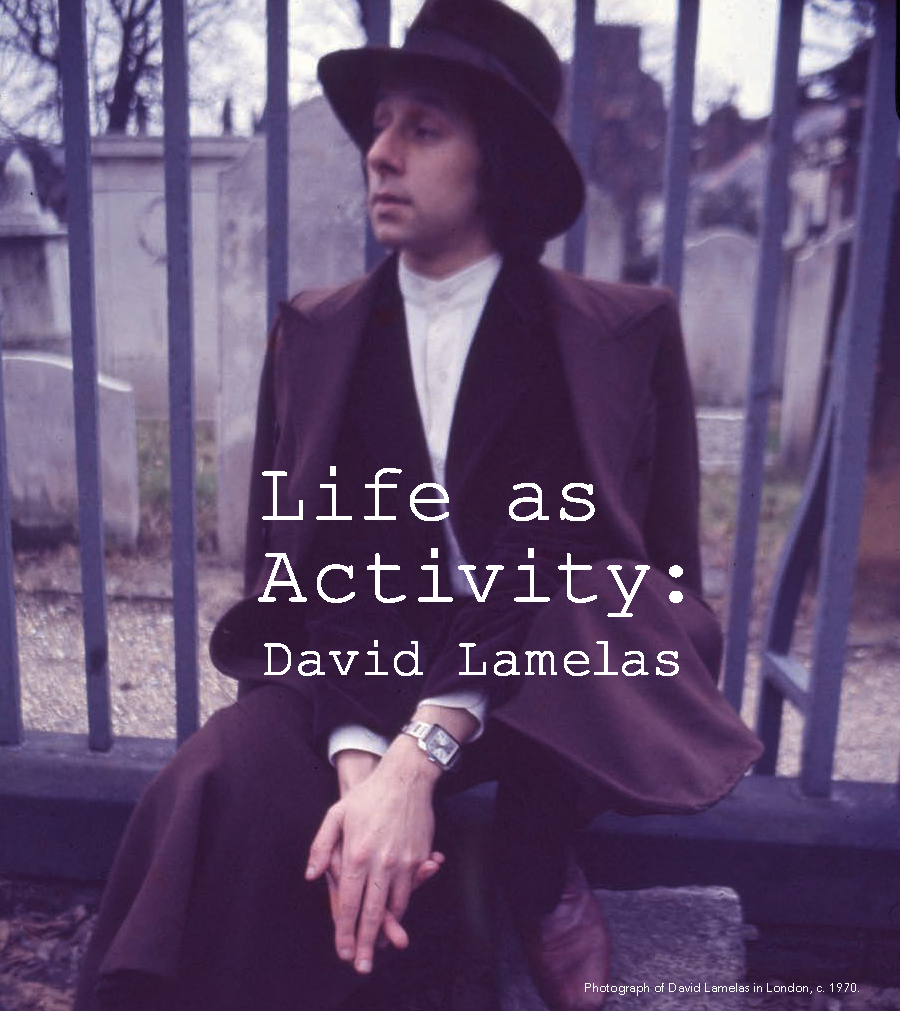
Multiple works by David Lamelas selected by Adam Szymczyk are included in the program of the 22nd edition of experimental film and video festival Videoex 2020 in Zürich. On Friday 18/09 at 7:30 pm: Argentina II: Time as Activity - David Lamelas and on Sunday 20/09 at 4 pm: Argentina III: Movies and Television: David Lamelas and at 5:45 pm: Argentina IV: In Our Time - David Lamelas.
08/09/20
Johannes Vermeer Award 2020 goes to Rineke Dijkstra
The Johannes Vermeer Award 2020, the Dutch state prize for the arts, is awarded to photographer Rineke Dijkstra by Ingrid van Engelshoven, Minister of Education, Culture and Science.
The Johannes Vermeer Award consists of the sum of 100,000 euros, which the winner may use to fund a special project in his or her specific field. The Dutch government established the award in 2009, its aim being to honour and encourage exceptional artistic talent. The award is intended for artists working in the Netherlands and across all disciplines. Previous laureates are opera director Pierre Audi, filmmaker and writer Alex van Warmerdam, photographer Erwin Olaf, visual artist Marlene Dumas, architect Rem Koolhaas, graphic designer Irma Boom, composer and director Michel van der Aa, film director visual artist Steve McQueen, fashion designer Iris van Herpen, and violinist Janine Jansen.
photo © Dana Lixenberg
30/08/20
The gallery participates in the upcoming edition of Brussels Gallery Weekend and will be open on Thursday 03/09 from 11 am till 9pm; and from Friday 04/09 till Sunday 06/09 from 11 am till 7pm.
01/08/20
Curator Hilde Teerlinck and Francis Alÿs are selected to represent Flanders within the Belgian Pavilion for the 2022 edition of La Biennale di Venezia.
“Do We Live Because We Narrate?”, developed by Hilde Teerlinck and Francis Alÿs for the Belgian Pavilion will question the role of the artist and the relevance of art in situations of conflict and crisis.
“It is not a case of war journalism, but a chronicle of the tactics of living developed when the systems social / economic / governmental / you name it – are not operative anymore, circumstances where you find a moment of creation, of need and of tension. It is a chronicle of the way in which people develop strategies of survival in and after a situation of conflict.”
Francis Alÿs, Beirut, March 2009